Collateral Design Systems
Company: CRH O’Regan System
Role: Designer, Brand Strategist
Project Type: Marketing Collateral Redesign & Brand Systems Implementation
Overview
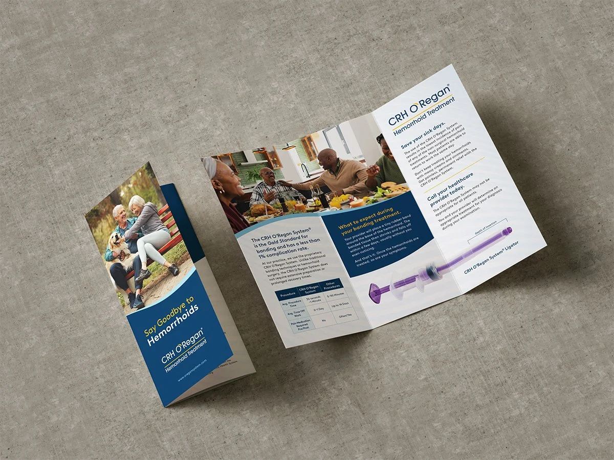
CRH O'Regan System provides non-surgical hemorrhoid treatment to healthcare providers and patients. However, the clinic-facing marketing materials, including brochures, referral pads, patient education guides, and promotional posters, were outdated and visually inconsistent with the brand refresh applied elsewhere. Additionally, educational materials were cluttered and difficult for patients to understand. Stakeholders flagged that existing materials weren't effectively communicating the procedure's key benefits or educating patients, which was limiting their utility in clinical settings. The objective was to redesign the full suite of downloadable materials with updated branding, improved visual hierarchy, and clearer patient education to drive better implementation and clinical outcomes.
My Role
Owned the full project scope from discovery through final delivery
Audited existing materials to identify consistency gaps and patient comprehension issues
Designed and art-directed all collateral pieces (brochures, referral pads, patient discussion tools, posters, follow-up care guides)
Implemented new brand visual language consistently across materials
Collaborated with Creative Director on strategic direction and revisions
Problem
Existing materials were a patchwork of inconsistent visual styles, outdated photography, and dense, clinic-focused copy that didn't resonate with patients. While the content was clinically accurate, it was poorly organized, and patients struggled to understand what the procedure entailed and follow post-procedure instructions.
Beyond aesthetics, the materials lacked visual hierarchy and strategic content prioritization. Key patient benefits were buried in text-heavy sections. Images didn't reflect the modern clinical setting or diverse patient demographics. The branding voice was inconsistent; some materials felt clinical and sterile, while others were overly promotional. This inconsistency undermined trust and made it harder for providers to use materials confidently with patients.
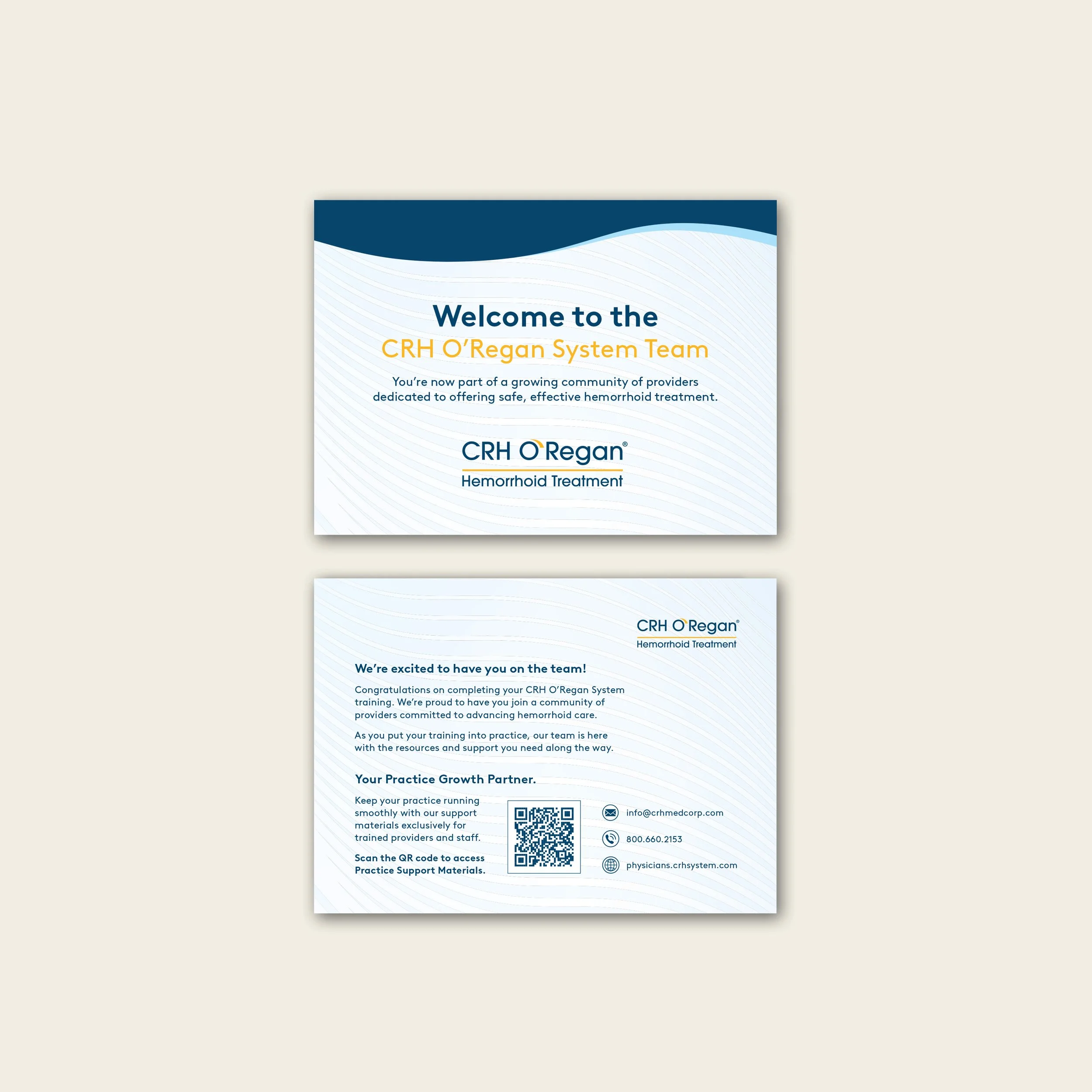
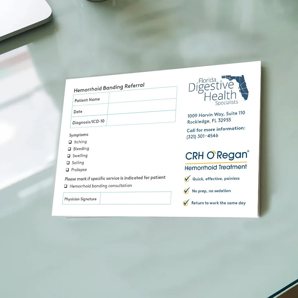
Expanded Product Suite
Provider Welcome Cards and Referral Prescription Pads were new materials that extended the brand system beyond what existed previously.
Research & Insight
I conducted a stakeholder audit and competitive review of the materials updated so far. Key insights emerged:
Visual hierarchy drives comprehension: Patients scan, not read. Organizing information by visual weight (bold callouts, icons, whitespace) improved understanding and recall versus dense paragraphs.
Narrative structure matters: Patients need a clear journey, from "what is this?" to "why should I do this?" to "what happens next?" Materials should guide them through this progression, not dump information.
Authentic imagery builds trust: Stock photos of happy patients in clinical settings resonated more than diagrams alone. Diverse, relatable faces signaled that this treatment was for people like them.
Reduce cognitive load: The original materials tried to teach too much. Reducing scope to essential patient-facing content (symptoms, procedure benefits, recovery expectations) and reserving detailed clinical info for provider-only materials improved clarity.
Before
After
Design Approach
Implemented a consistent visual system: Applied the brand refresh across all materials, updated the color palette, typography, spacing, and background so materials felt unified and current while maintaining clinical credibility.
Redesigned information architecture: Reorganized content into scannable sections with clear hierarchy: symptoms → procedure overview → benefits → expectations → recovery. Used visual callouts, icons, and color coding to guide patients through the journey.
Replaced and curated imagery: Sourced new photography featuring diverse patients and modern clinical settings; removed cluttered diagrams in favor of clear, labeled anatomical illustrations that patients could understand quickly.
Streamlined copy for clarity: Worked with Clinical Staff to retain medically accurate, doctor-approved content while cutting jargon and unnecessary detail. Prioritized patient benefits over technical specs for patient-facing materials.
Adapted layouts for use cases: Different materials served different purposes; referral pads needed brevity, patient discussion tools needed depth, follow-up guides needed actionable steps. Each was designed accordingly while maintaining brand consistency.
Before
After
Outcome
Physician and patient feedback was consistently positive; stakeholders noted that the materials were "clean and clear," making conversations with patients easier and more productive. Providers reported that patients understood the procedure and benefits more quickly, reducing the need for lengthy explanations. The unified branding also elevated the perceived quality and credibility of the materials in clinical settings.
Reflection
This project reinforced to me that effective medical marketing requires balancing clinical accuracy with patient accessibility, and that visual design is often the bridge between the two. By prioritizing hierarchy, narrative flow, and authentic imagery, I transformed dense clinical content into materials that patients could actually understand and act on. It also reinforced how important it is to audit existing work before redesigning; this revealed not just aesthetic gaps but strategic opportunities to reframe messaging. The positive clinic re-orders validated that thoughtful information design directly impacts business outcomes in healthcare.