Digital Campaign
Client: Erie VA Whole Health
Role: Art Director, Designer, Strategist, Copywriter
Project Type: Digital Campaign & Messaging Refresh
Overview
The Move With Purpose digital campaign was developed to modernize Erie VA Whole Health’s messaging and better reflect the department’s true approach to Veteran care. The goal was to replace outdated, confusing branding with a clear, actionable message that resonated with patients and aligned with facility priorities.

My Role
Led creative direction and messaging strategy
Developed campaign concepts and the updated message architecture
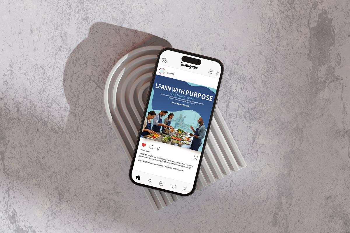
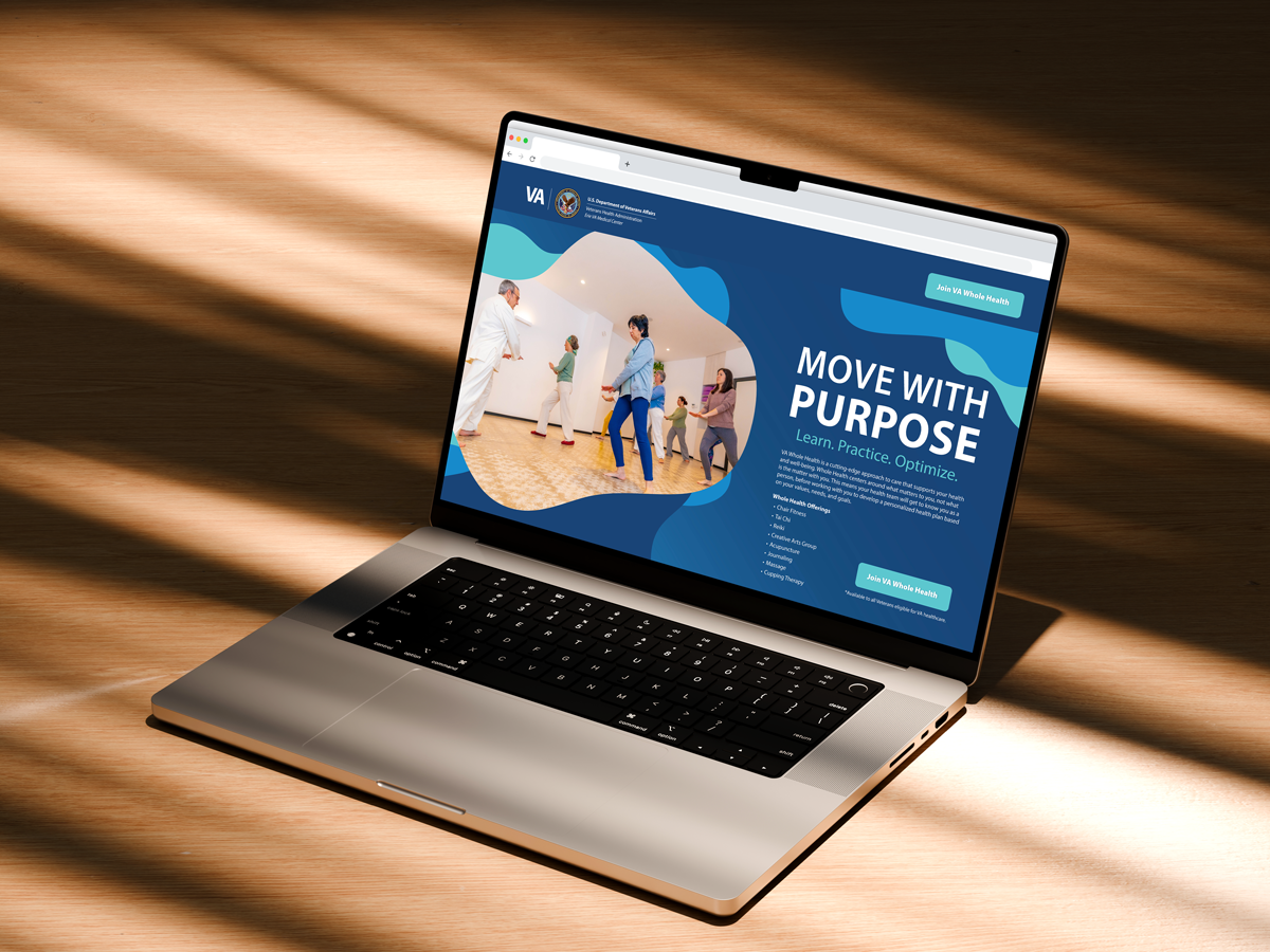
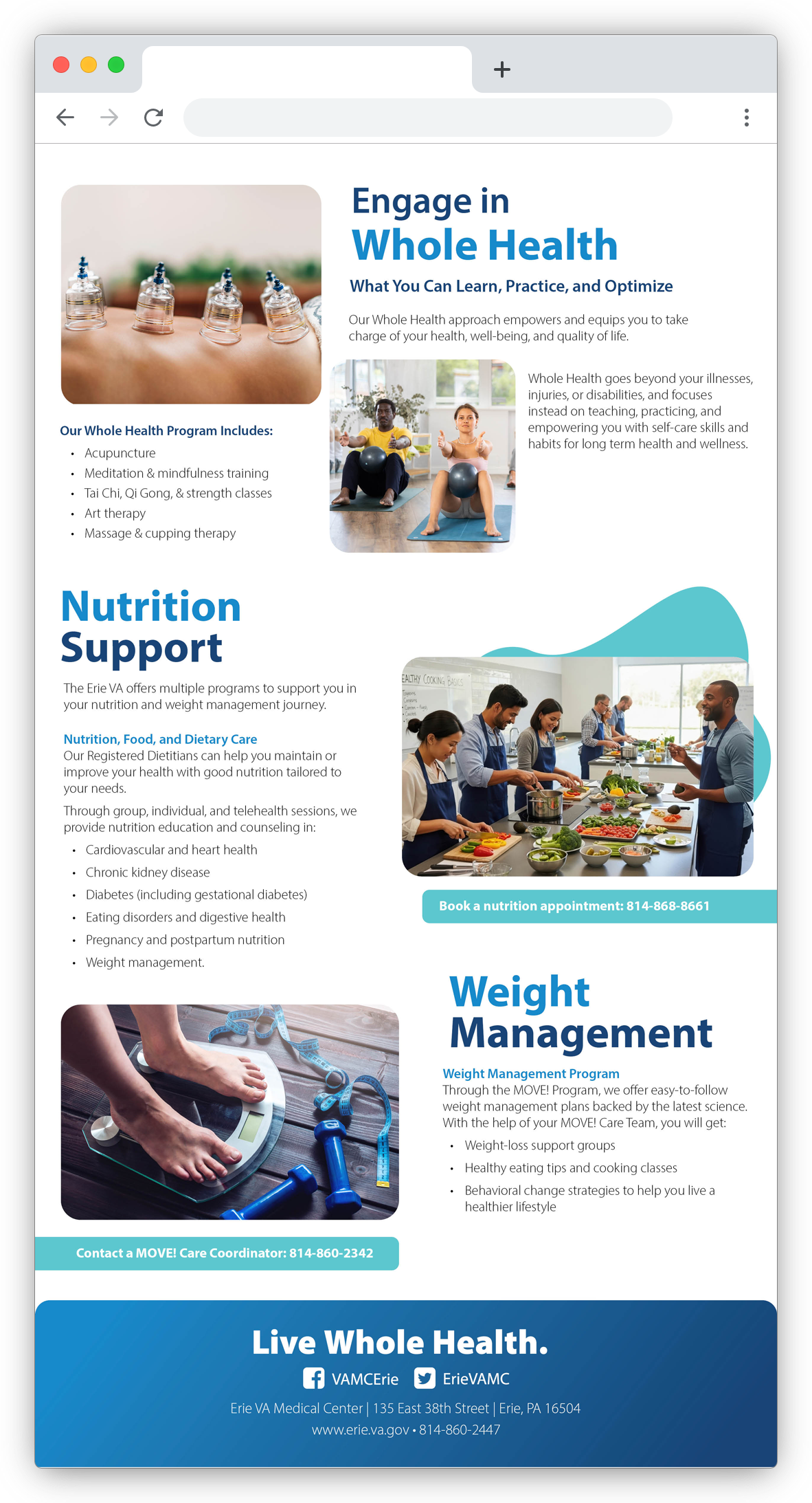
Designed digital and print deliverables, including digital displays, social assets, flyers, and email templates
Wrote copy for campaign materials and supporting content
Ensured alignment with national VA Whole Health branding while customizing for facility needs
Problem
Erie VA Whole Health’s previous messaging relied heavily on National branding elements that did not match the facility’s actual program focus. Veterans found the visuals confusing and the messaging overly complex, often overlooking these elements. The challenge was creating a refreshed communication system that stayed within VA guidelines while authentically representing the local department’s goals.
Research & Insight
I collaborated closely with Whole Health department managers to understand the program structure, Veteran needs, and staff frustrations with the existing materials. Through these conversations, several insights became clear:
The messaging needed to be more direct, simplified, and actionable.
Veterans responded better to practical, movement-based language than abstract wellness terms.
The brand required improved clarity around what Whole Health actually delivers at this facility.
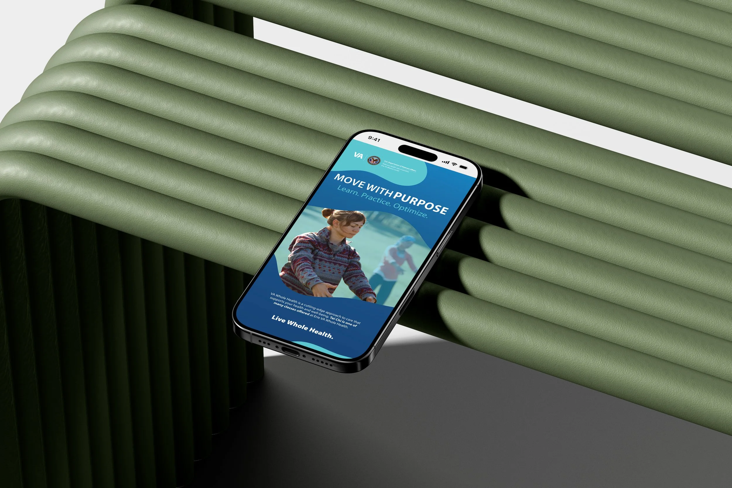
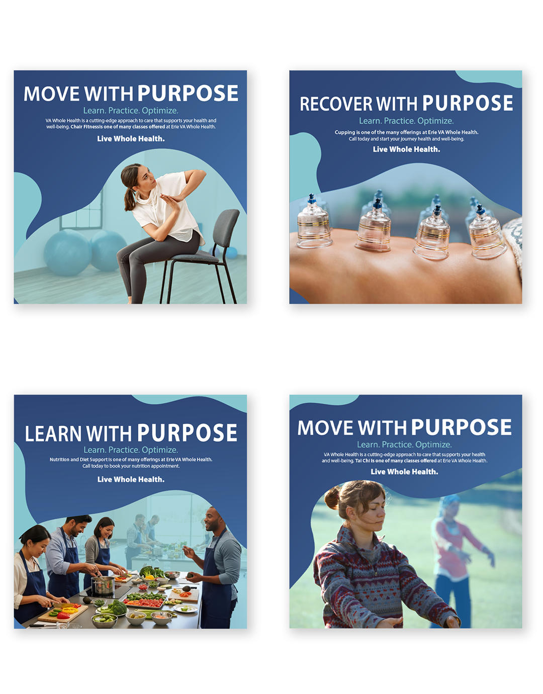
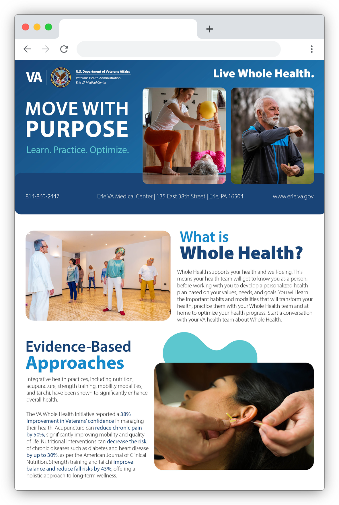
These insights informed the new messaging framework: Move With Purpose: Learn. Practice. Optimize.
Design Approach
Discovery & Alignment – Conducted working sessions with department managers to document goals, challenges, and program-specific terminology.
Message Architecture – Developed a simplified, action-focused message system emphasizing learning, practicing, and optimizing movement.
Visual Direction – Updated typography to increase clarity and introduced a consistent, facility-appropriate color palette. Designed refined, minimal layouts that communicated information quickly and avoided visual overload.
Responsive Design – Created adaptable templates for digital displays, social graphics, and the landing page to ensure consistency across all screen sizes.
Production – Designed the full suite of campaign materials, including digital signage, social graphics, flyers, email newsletters, and landing page assets.
Review & Refinement – Worked with staff to finalize visuals and messaging that felt accurate, accessible, and representative of their work.

Outcome
Staff responded enthusiastically to the refreshed campaign, expressing that it finally communicated what their department truly does. The clearer message and updated visual system created new alignment between staff, patients, and departmental goals, setting the foundation for improved engagement across digital and physical touchpoints.
Reflection
This project reinforced the importance of grounding design in real-world usage and audience perception. By listening to staff and understanding patient reactions, I was able to create a message and visual system that was not only clearer but also more authentic. It strengthened my approach to designing within strict brand guidelines while still crafting materials that genuinely resonate with local needs.